Color Grading
Wedding Photo Colour Grading Styles: Choosing a Look That Lasts
Colour correction makes a photo accurate; colour grading gives a whole album its mood. The right grade depends on the light you shot in, the skin tones of the couple and how the album will age. This article compares the common wedding looks, explains what each one does to tones and colours, and shows how to keep one grade consistent across hundreds of photos and several functions.
By Smart Photo Selection TeamUpdated 5 min readIn Color Grading
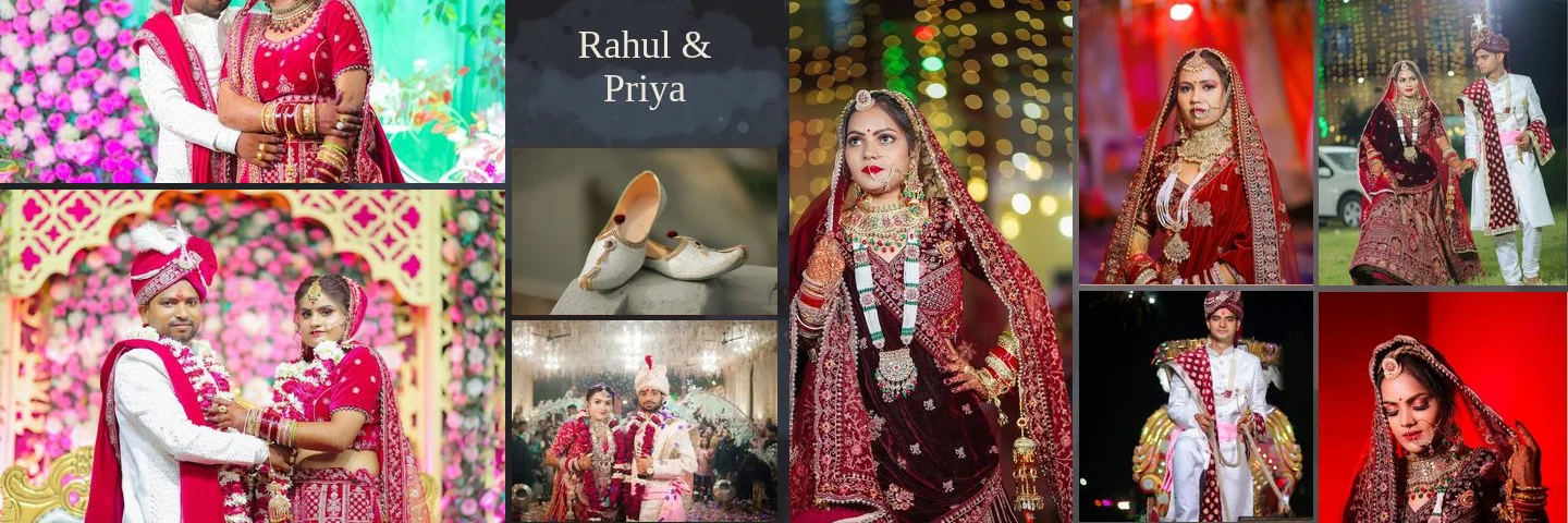
Correction first, grading second
Grading on top of uncorrected photos amplifies their problems. Before choosing a look, make each photo neutral: fix white balance so whites are white, set exposure so skin sits in the midtones, and recover highlights on white outfits. Only then apply the grade. If the base is consistent, the same grade will look consistent too.
Skin is the reference point for every decision. A grade that makes décor beautiful but turns skin grey, orange or magenta is the wrong grade. Check faces at 100 % on every sheet.
The common wedding looks
| Style | Tones | Colour | Suits |
|---|---|---|---|
| Warm and natural | Normal contrast, open shadows | Slightly warm white balance, natural saturation | Daylight ceremonies, Indian weddings with red and gold |
| Film-inspired | Lifted blacks, soft highlight roll-off | Muted greens, warm skin, gentle colour shifts | Outdoor and destination weddings, couples who like a vintage feel |
| Clean and bright | Bright exposure, low contrast | Neutral to slightly cool whites, pastel colours | White and pastel outfits, garden weddings |
| Moody cinematic | Deeper shadows, controlled highlights | Reduced saturation, cool shadows, warm skin | Evening portraits, receptions, dramatic venues |
| Teal and orange | Medium to high contrast | Cool shadows, warm skin and highlights | Use lightly; strong versions date quickly |
Warm and natural
The safest choice for most Indian and traditional weddings. It flatters warm skin tones and keeps reds, maroons and gold looking rich. Its risk is going too warm: skin turns orange and white outfits look cream. Keep a neutral reference, such as a white shirt or a white wall, close to white.
Film-inspired
Characterised by a lifted black point (blacks become dark grey), softer highlights and muted greens. It hides small exposure differences, which helps consistency, but it can make dark skin look washed out if the blacks are lifted too far. Use a gentle lift.
Clean and bright
Airy and pastel, popular for daytime and garden weddings. It needs well-exposed originals; underexposed photos pushed bright show noise and lose skin texture. It pairs naturally with white and blush album pages.
Moody cinematic
Deeper shadows and lower saturation give weight and drama. It suits evening events and dark album pages. Two cautions: dark images print darker than they look on a bright screen, and heavy desaturation makes festive colours look dull. Keep skin warm and alive even when the rest is muted.
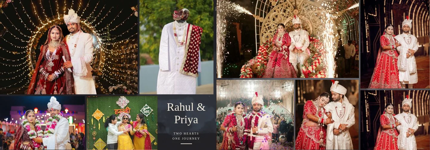
Teal and orange
Pushing shadows towards teal and skin towards orange creates strong colour contrast. A light touch adds depth; a heavy one is easy to recognise and tends to look dated in a few years. Albums are meant to last decades, so err on the subtle side.
How the tools map to the looks
- Curves: contrast (S-curve), matte blacks (lift the black point), and per-channel colour shifts in shadows or highlights.
- HSL: control specific colours, for example calming over-saturated greens or keeping reds from clipping, without touching skin.
- Colour balance: tint shadows, midtones and highlights separately; the core of split-toned looks.
- Selective colour: refine skin (reds and yellows) independently of the grade.
- Gradient map: strong, stylised looks and black-and-white conversions with a tint.
- Effects: clarity, dehaze, vignette and grain, used sparingly.
All of these are in Smart Photo Selection's photo editor, along with import of Lightroom/Camera Raw .xmp presets, .acv curves and .cube LUTs, so you can reuse a grade you already have. The step-by-step instructions are in how to colour grade wedding photos.
Consistency across an album
Readers forgive a grade they would not have chosen; they notice a grade that changes from page to page. Consistency matters more than the specific look.
- Pick one look per album, or one per function if events have very different light (day haldi, night sangeet). Change the look at chapter breaks, not mid-chapter.
- Grade a reference photo first for each lighting situation, then copy those settings to similar photos.
- Compare facing pages. Two photos side by side on a spread show differences that are invisible one at a time.
- Mixed cameras and second shooters need their own correction before the shared grade.
- Match the page. A warm grade on a cool blue wash, or a bright grade on a dark page, looks pasted on.
Choosing a grade with your client
Show two or three graded versions of the same photo, including the couple's skin, before you grade the whole album. Ask which feels like their wedding, not which is trendiest. Keep their choice written down for the album brief, and use it again for parents' albums so all copies match.
Grading is one part of a larger album workflow. For how it fits with selection, AI layout and review, read AI wedding album design: the complete guide, and for skin specifically, natural skin retouching.
colour gradingwedding editingconsistencypresets
Frequently Asked Questions
Should I grade before or after designing the album?
Grade consistently before final review. Many photographers grade the delivery set first, then make small per-spread adjustments in the album so facing photos match.
Can I use my existing Lightroom presets in Smart Photo Selection?
Yes, as .xmp files. Basic, tone curve and white-balance settings are imported; unsupported settings are listed so you know what was skipped.
Does grading change how the album prints?
Yes. Dark and heavily desaturated grades are more sensitive to printing. Check shadows and ask your lab for a proof if the look is moody.
Is a black-and-white spread a good idea?
A few black-and-white spreads can give rhythm, for example for emotional moments, but keep them grouped and consistent rather than scattered.
Related Articles
- AI Wedding Album Design: The Complete GuideHow AI wedding album design works, what it does well, where you still decide, and a practical workflow from photo selection to print-ready export.
- Natural Skin Retouching for Wedding Photos: What to Fix and What to LeavePrinciples of natural skin retouching for wedding albums: what to remove, what to keep, preserving texture, consistency across spreads and asking clients.
- Indian Wedding Album Design Ideas: Haldi, Mehndi, Sangeet, Wedding and ReceptionIndian wedding album design ideas for every function: haldi, mehndi, sangeet, baraat, pheras, vidaai and reception, with layouts, palettes and pacing.
Step-by-Step Guides
- How to Colour Grade Wedding Photos in Smart Photo SelectionCorrect and grade wedding photos on an album sheet with Curves, HSL, Color Balance, Gradient Map and presets, then copy the look to every photo for consistency.
- How to Use Layers, Layer Masks and Clipping Masks in Smart Photo SelectionLearn how layers, layer masks, clipping masks and adjustment layers work in the Smart Photo Selection editor, with the exact menu names and shortcuts.
- How to Prepare a Wedding Album for PrintA print checklist for Smart Photo Selection: resolution and DPI, low-ppi warnings, centre fold, trim and safe area guides, bleed, sRGB colour and what to ask your album lab.
Related Features
Design Your Next Album in Smart Photo Selection
Generate spreads from a booking's photos, refine them in the layer-based editor and export print-ready files.